
Use Case

Low-code software development
2018-2023
The Project, the Challenge
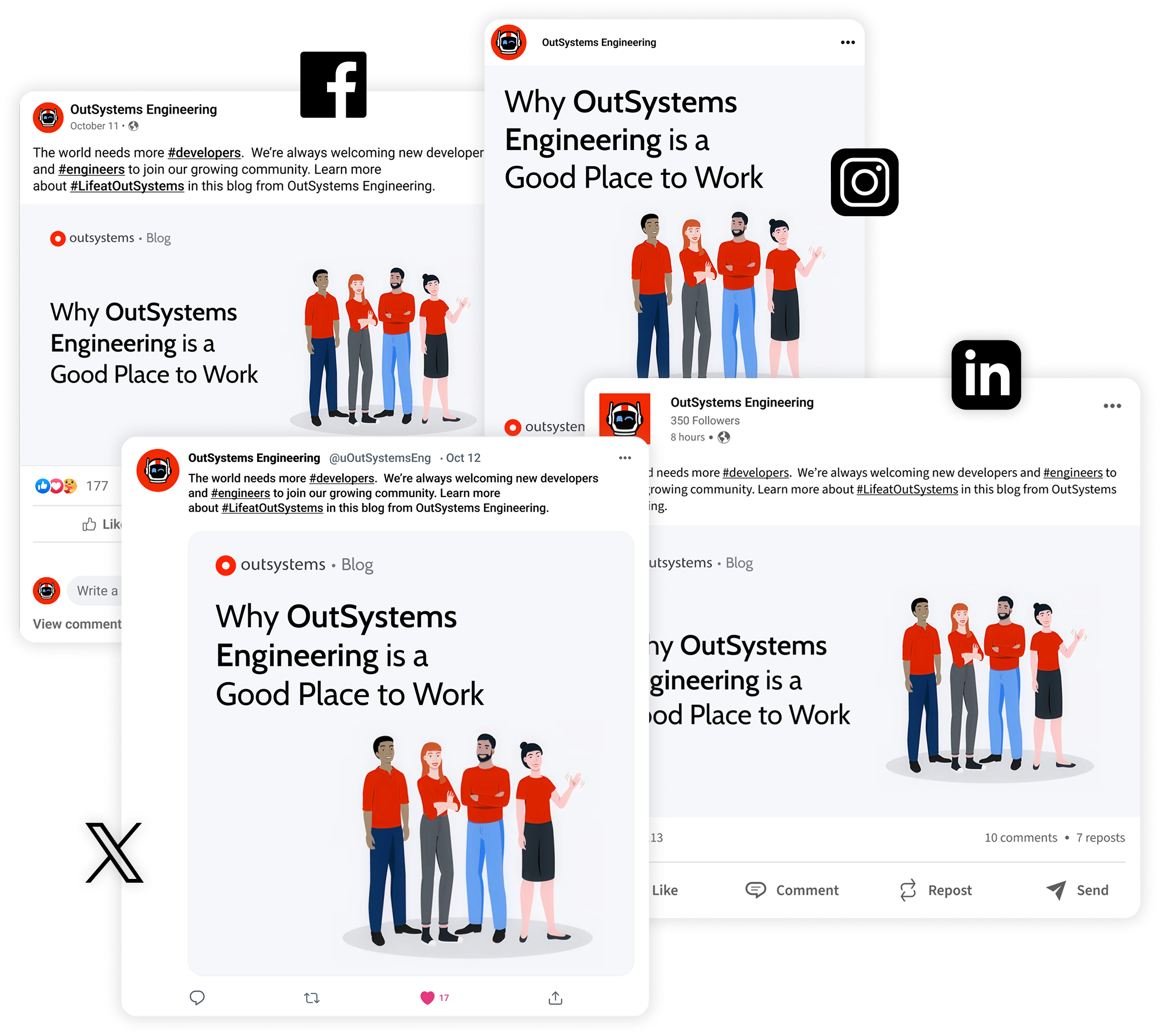
During my time at OutSystems, I collaborated with the Marketing team to develop a cohesive Social Media System, on a structured approach to layouts, typography and illustration that could scale across platforms, while maintaining flexibility for different types of communication.My role as a Graphic Designer was to assist posts with visual assets and contribute with new ideas to up-level engagement and followers.
All assets were created following OutSystems Brand Guidelines.
The Challenge
Social media content often becomes visually inconsistent over time, especially when multiple formats and messages are involved. The challenge was to create a system that could maintain brand clarity, meaning that the main brand could be instantly recognized anywhere, while allowing for diverse content.
Design System
Typography
- Titles font: Cabin
- Clear hierarchy for headlines, captions, and highlights
Layout
- Modular grid system
- Text on the left, visual support on the right
Color
- Follows Brand Guidelines’ established palette
- Consistent contrast for readability
Types of Content
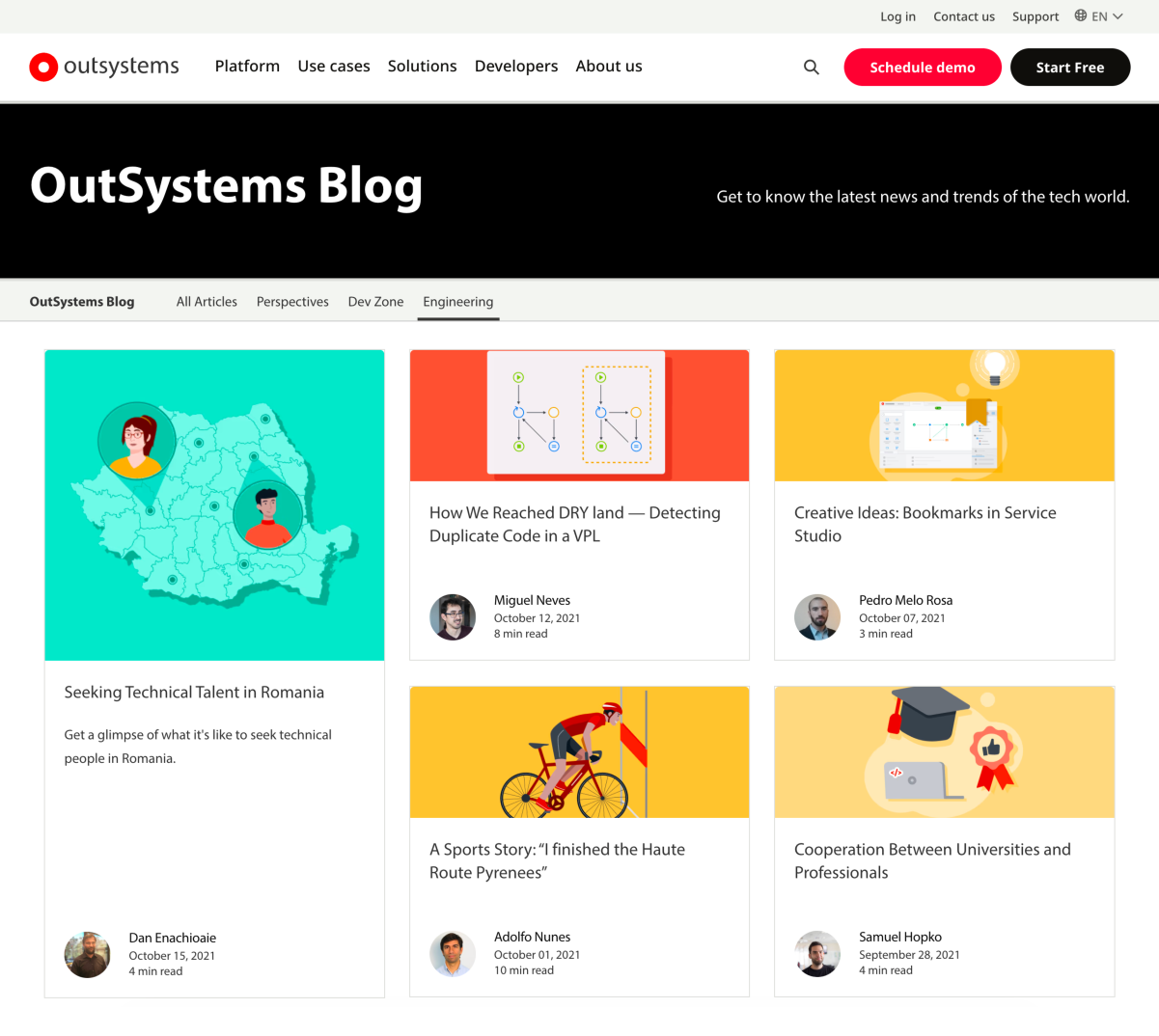
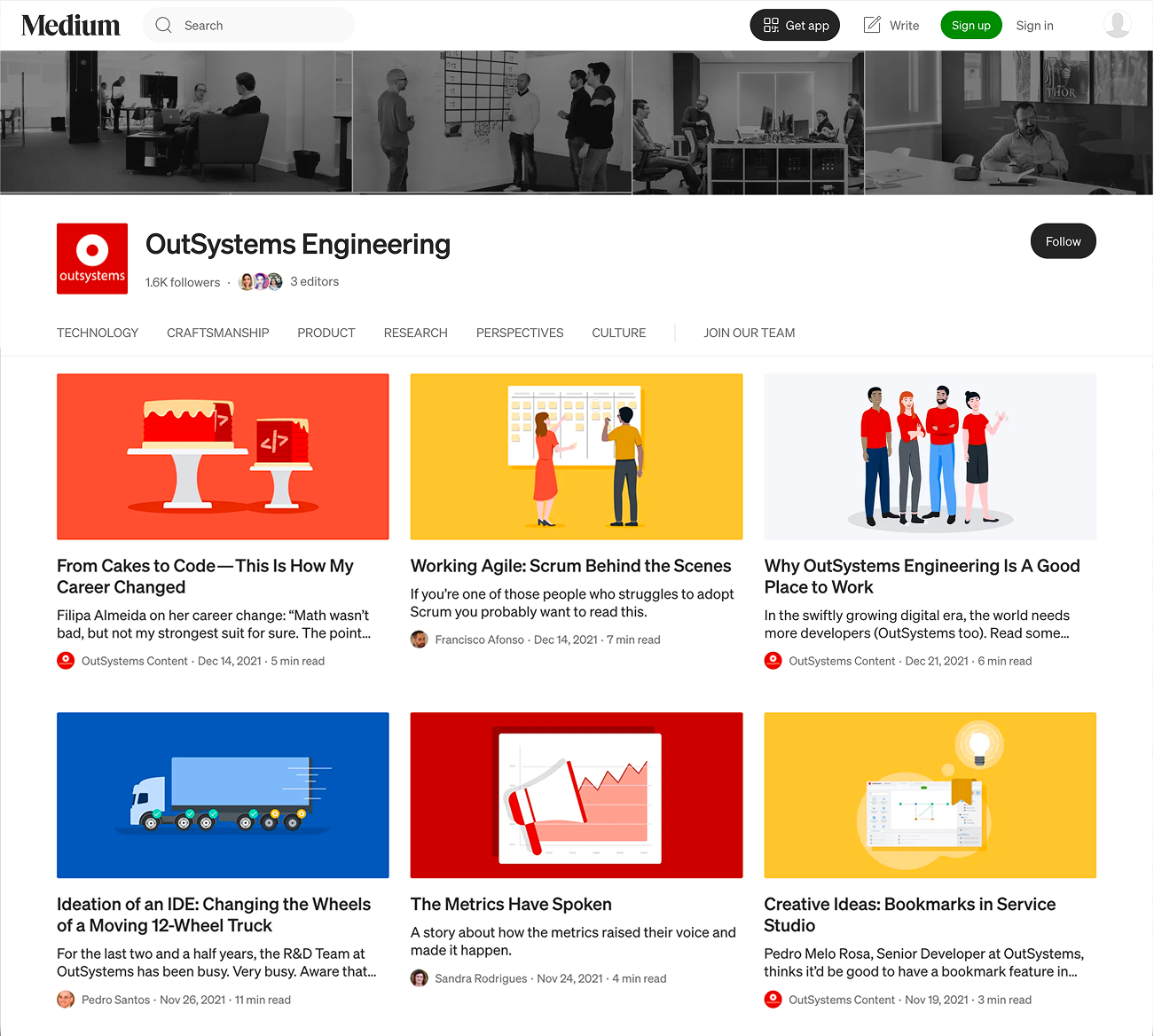
1. Editorial - News & Articles
Design System Approach: Bright, colorful backgrounds, 2D illustrations with a sense of depth achieved by adding shadows. Each illustration was carefully curated for each article, bringing attention to the main subject. Using human figures whenever possible was a way to show not only the human side of the “behind the scenes” of a tech business, but also its diversity.
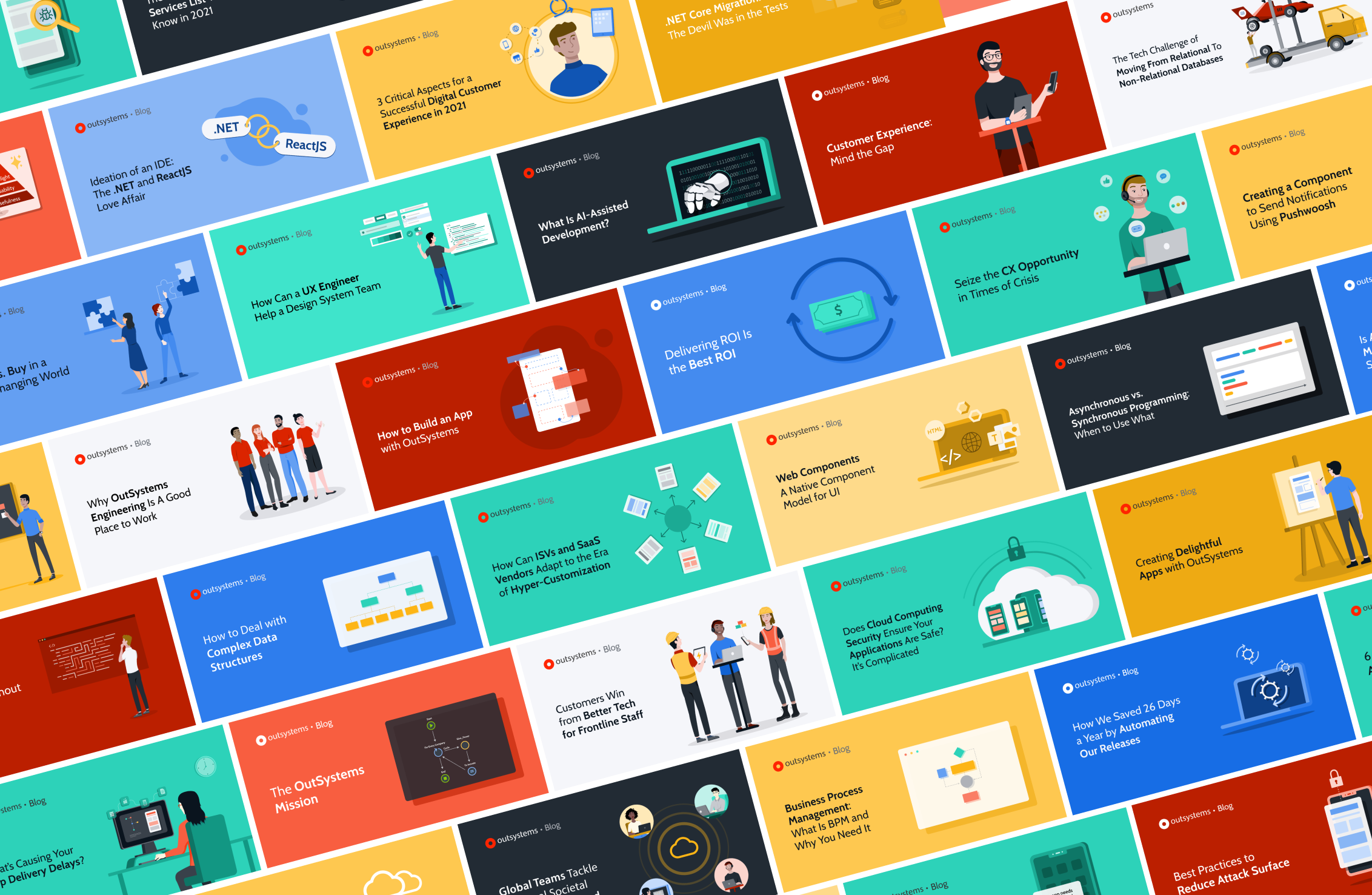
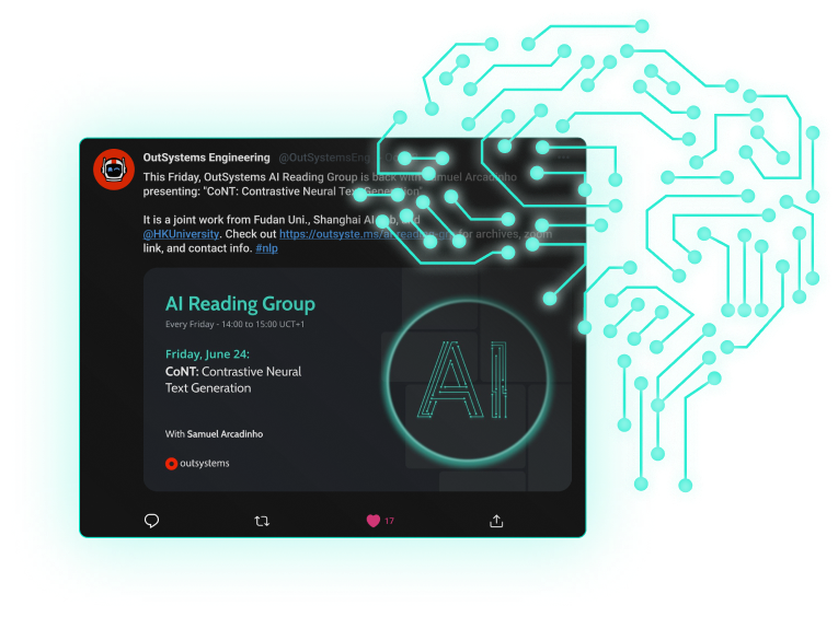
2. Key date posts
Following the same approach as Editorial posts, but adding motion to the graphics with the intent of captivating viewers and generate engagement.
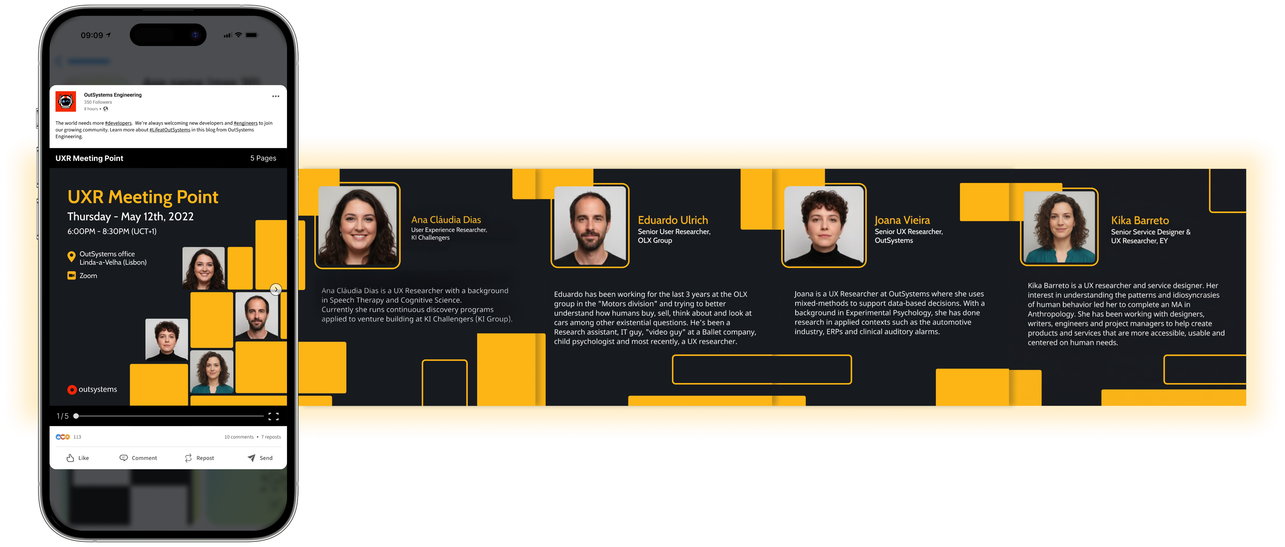
3. Event promotion posts
To promote online/ on-site events, the guideline consisted in using photography instead of illustration. Besides that, to distinguish the different topics, the defined common element was a pattern made of dynamic rectangles, with designated colors for each.
UX/UI related events
Partnerships
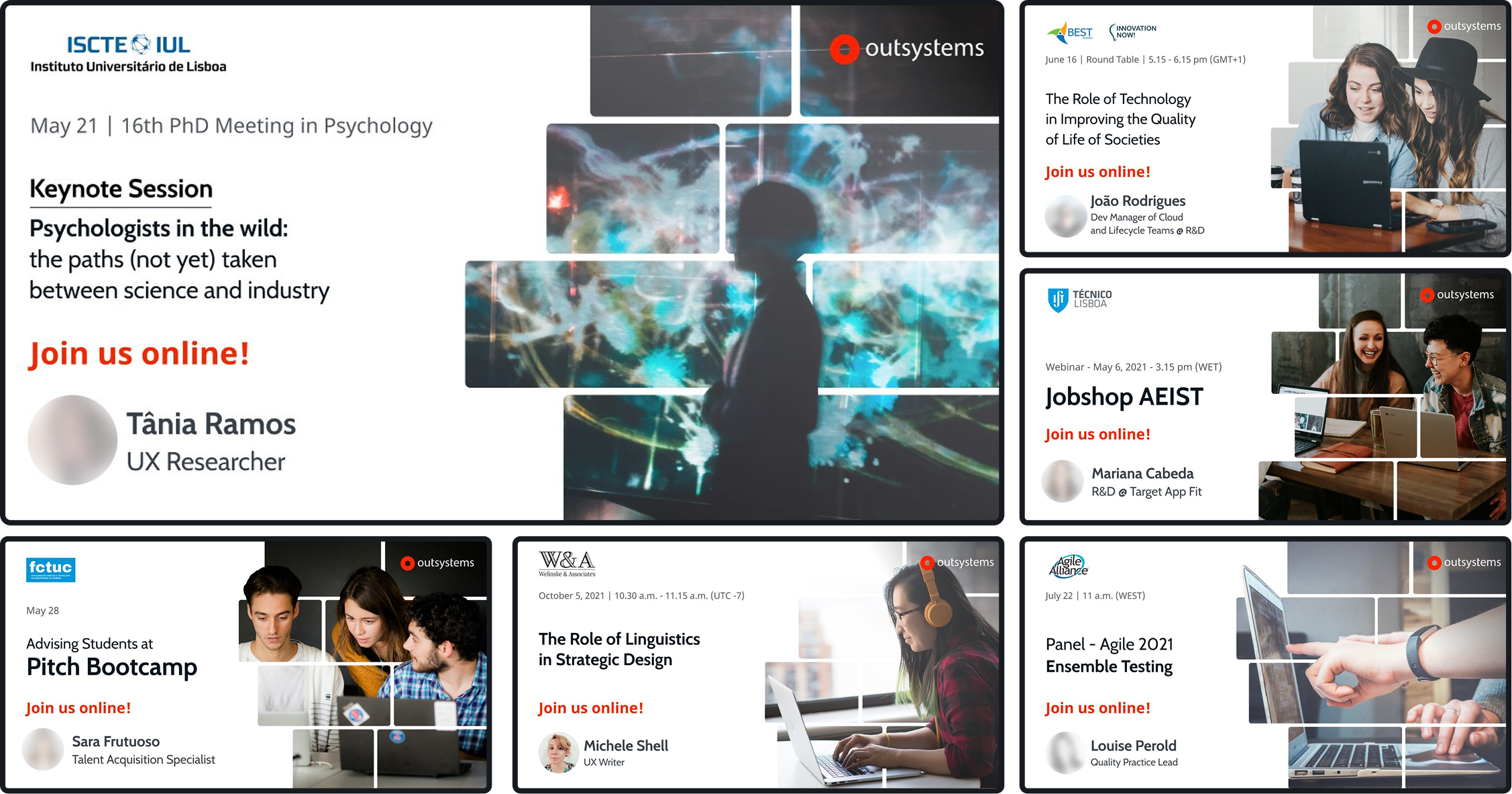
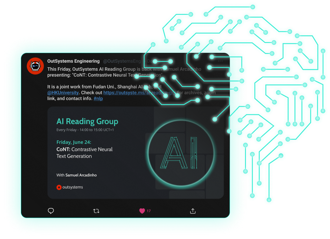
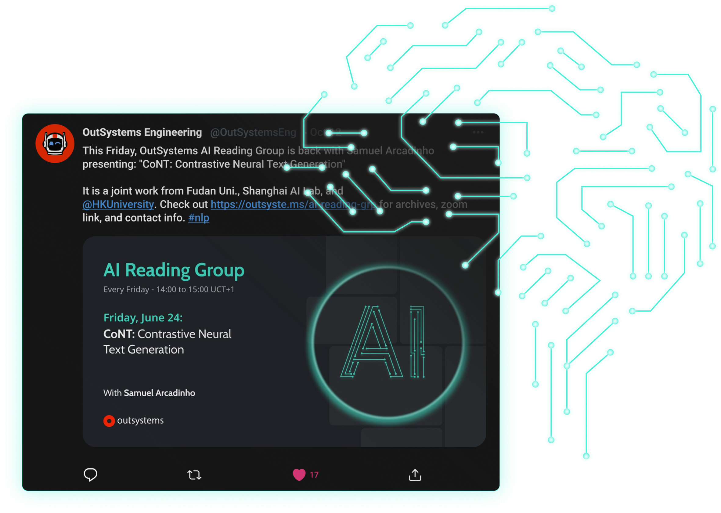
AI Talks
These systems were designed to be easily expanded, allowing new content to be created while maintaining consistency across all future communications.
Tools
Graphics & Layout

Figma

Illustrator

AfterEffects

Use Case

Low-code software development
2018-2023
The Project, the Challenge
During my time at OutSystems, I collaborated with the Marketing team to develop a cohesive Social Media System, on a structured approach to layouts, typography and illustration that could scale across platforms, while maintaining flexibility for different types of communication.My role as a Graphic Designer was to assist posts with visual assets and contribute with new ideas to up-level engagement and followers.
All assets were created following OutSystems Brand Guidelines.
The Challenge
Social media content often becomes visually inconsistent over time, especially when multiple formats and messages are involved. The challenge was to create a system that could maintain brand clarity, meaning that the main brand could be instantly recognized anywhere, while allowing for diverse content.
Design System
Typography
- Titles font: Cabin
- Clear hierarchy for headlines, captions, and highlights
Layout
- Modular grid system
- Text on the left, visual support on the right
Color
- Follows Brand Guidelines’ established palette
- Consistent contrast for readability
Types of Content
1. Editorial - News & Articles
Design System Approach: Bright, colorful backgrounds, 2D illustrations with a sense of depth achieved by adding shadows. Each illustration was carefully curated for each article, bringing attention to the main subject. Using human figures whenever possible was a way to show not only the human side of the “behind the scenes” of a tech business, but also its diversity.
2. Key date posts
Following the same approach as Editorial posts, but adding motion to the graphics with the intent of captivating viewers. Campaign created to celebrate symbolic international days/weeks/months and to generate engagement.
3. Event promotion posts
To promote online/ on-site events, the guideline consisted in using photography instead of illustration. Besides that, to distinguish the different topics, the defined common element was a pattern made of dynamic rectangles, with designated colors for each.
UX/UI related events
Partnerships
AI Talks
These systems were designed to be easily expanded, allowing new content to be created while maintaining consistency across all future communications.
Tools
Graphics & Layout

Figma
Illustrator
AfterEffects

Use Case
Low-code software development
2018-2023
The Project, the Challenge
During my time at OutSystems, I collaborated with the Marketing team to develop a cohesive Social Media System, on a structured approach to layouts, typography and illustration that could scale across platforms, while maintaining flexibility for different types of communication.My role as a Graphic Designer was to assist posts with visual assets and contribute with new ideas to up-level engagement and followers.
All assets were created following OutSystems Brand Guidelines.
The Challenge
Social media content often becomes visually inconsistent over time, especially when multiple formats and messages are involved. The challenge was to create a system that could maintain brand clarity, meaning that the main brand could be instantly recognized anywhere, while allowing for diverse content.
Design System
Typography
- Titles font: Cabin
- Clear hierarchy for headlines, captions, and highlights
Layout
- Modular grid system
- Text on the left, visual support on the right
Color
- Follows Brand Guidelines’ established palette
- Consistent contrast for readability
Types of Content
1. Editorial - News & Articles
Design System Approach: Bright, colorful backgrounds, 2D illustrations with a sense of depth achieved by adding shadows. Each illustration was carefully curated for each article, bringing attention to the main subject. Using human figures whenever possible was a way to show not only the human side of the “behind the scenes” of a tech business, but also its diversity.
2. Key date posts
Following the same approach as Editorial posts, but adding motion to the graphics with the intent of captivating viewers. Campaign created to celebrate symbolic international days/weeks/months and to generate engagement.
3. Event promotion posts
To promote online/ on-site events, the guideline consisted in using photography instead of illustration. Besides that, to distinguish the different topics, the defined common element was a pattern made of dynamic rectangles, with designated colors for each.
UX/UI related events
Partnerships
AI Talks
These systems were designed to be easily expanded, allowing new content to be created while maintaining consistency across all future communications.
Tools
Graphics & Layout

Figma

Illustrator
AfterEffects