
Use Case

Cybersecurity SaaS
2023 - 2024
The Client, the Project
Probely is a web vulnerability scanner for agile teams. It finds security issues in web applications & APIs and provides guidance on fixing them.
Before being acquired by Snyk, Probely hired me to define the company’s Visual Brand Guidelines - they had a logo and some colors defined, but not a structure of visual elements to be used consistently across departments. The company was founded in 2016, meaning that by the time of my intervention (2023), we weren’t starting from zero.
The Goal

Define visual guidelines that are scalable across platforms.
Position Probely as a modern and trustworthy brand.
The Process
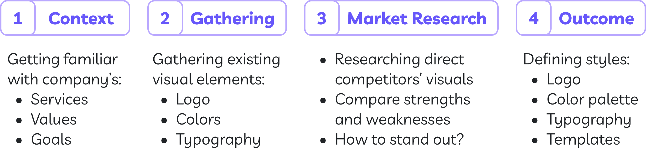
The Outcome
Logo
Original

Improved

Subtle yet striking modifications to the logo: bolder typography and smooth, rounded edges that embody a sophisticated and contemporary aesthetic.
Grid system
Besides the refinements mentioned above, this redesign was built on a precise grid system to ensure balance, optical clarity, and consistency. This grid-based constructions ensures the logo scales properly in size and also across digital and physical applications without losing is integrity.

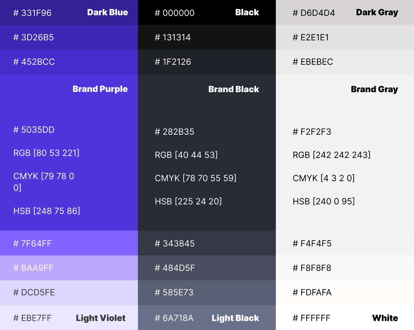
Colors
Primary colors & variations
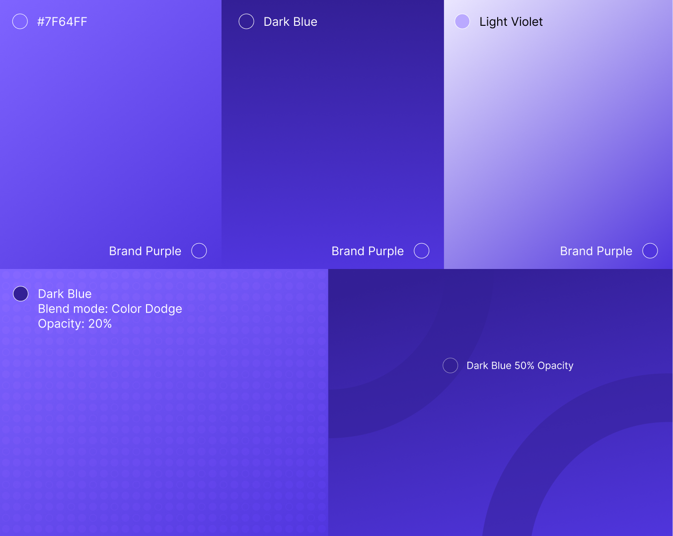
Gradients & Patterns
Typography
Font family: Inter
AaBbCc
AaBbCcDdEeFfGgHhIiJjKkLlMmNnOoPpQqRrSsTtUuVvWwXxYyZz 0123456789€£$&%@?![]()+-=
Heading 1
Font: Inter | Style: Black | Size: 48px | Line Height: 58px | Weight: 900
Heading 2
Font: Inter | Style: Black | Size: 32px | Line Height: 38px | Weight: 900
Heading 3
Font: Inter | Style: Bold | Size: 24px | Line Height: 28px | Weight: 700
Body Text
Font: Inter | Style: Regular | Size: 18px | Line Height: 28px | Weight: 400
Body Text Bold
Font: Inter | Style: Regular | Size: 18px | Line Height: 28px | Weight: 400
Iconography

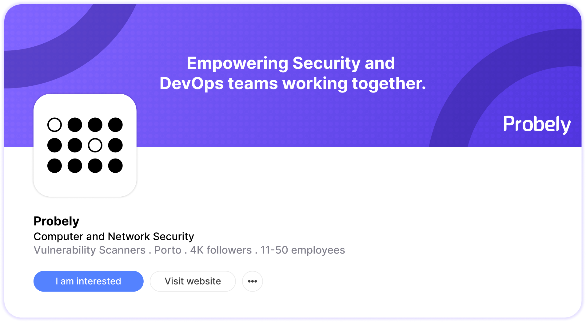
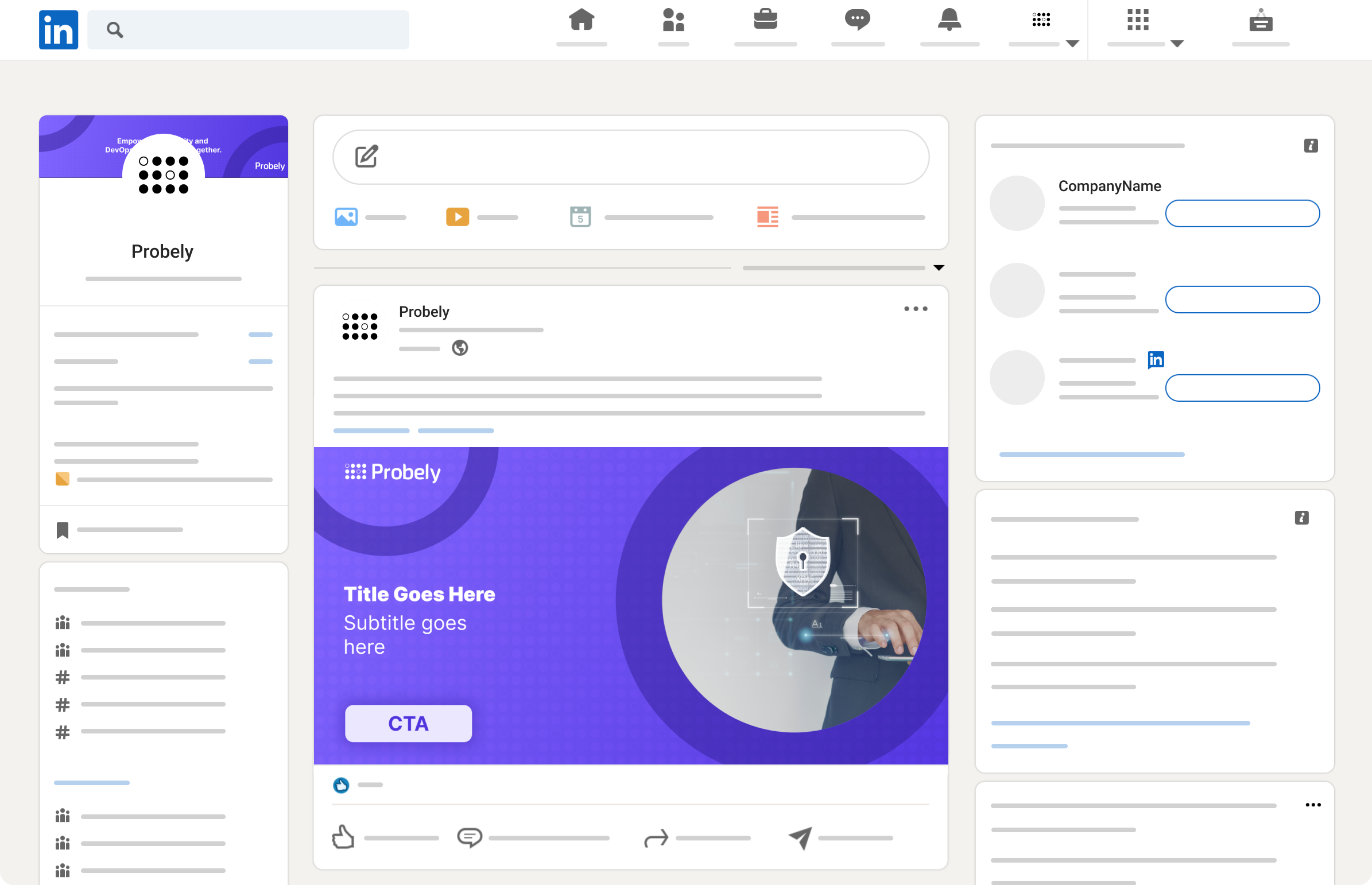
Social Media
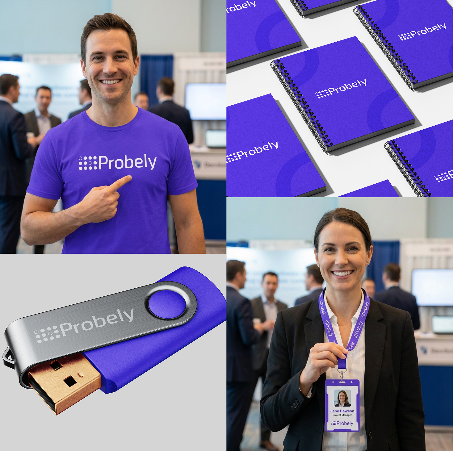
Merch
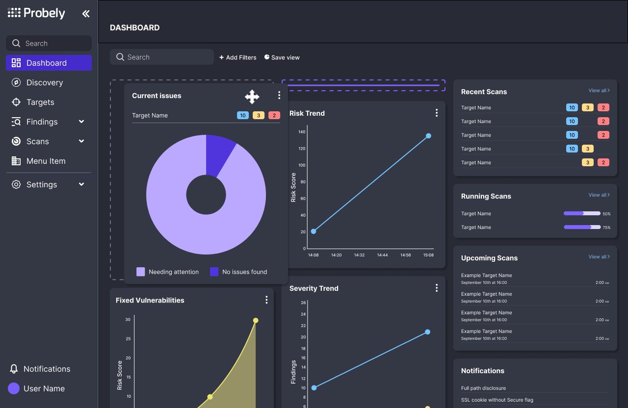
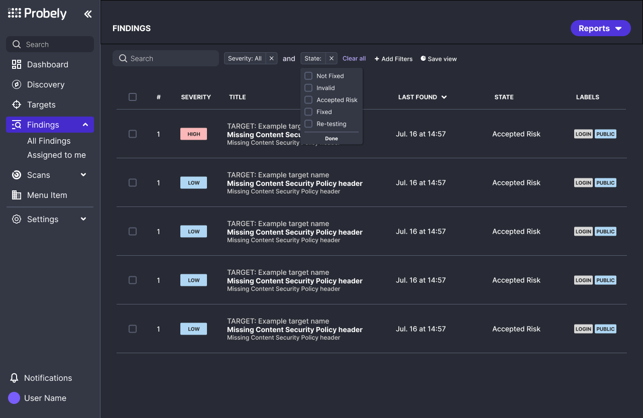
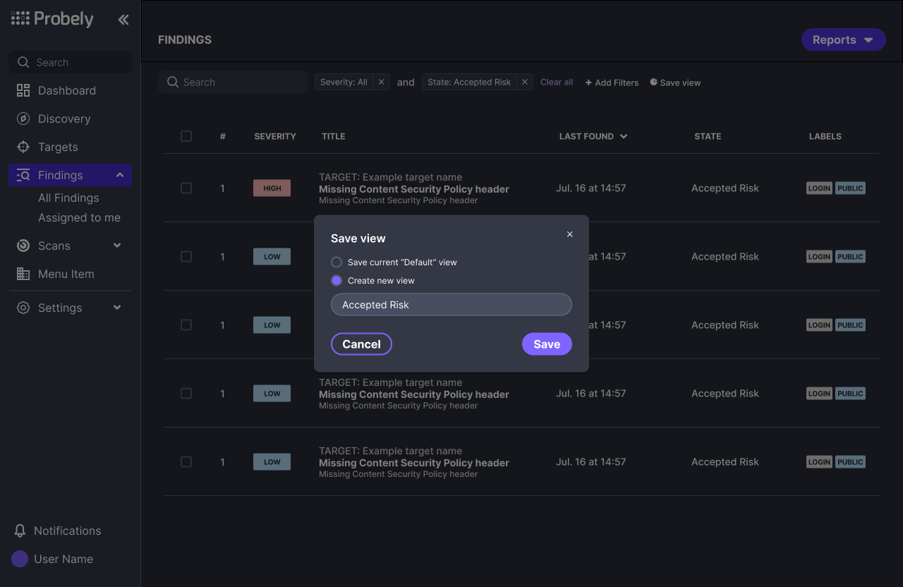
Design System
Local Components - Dark & Light mode
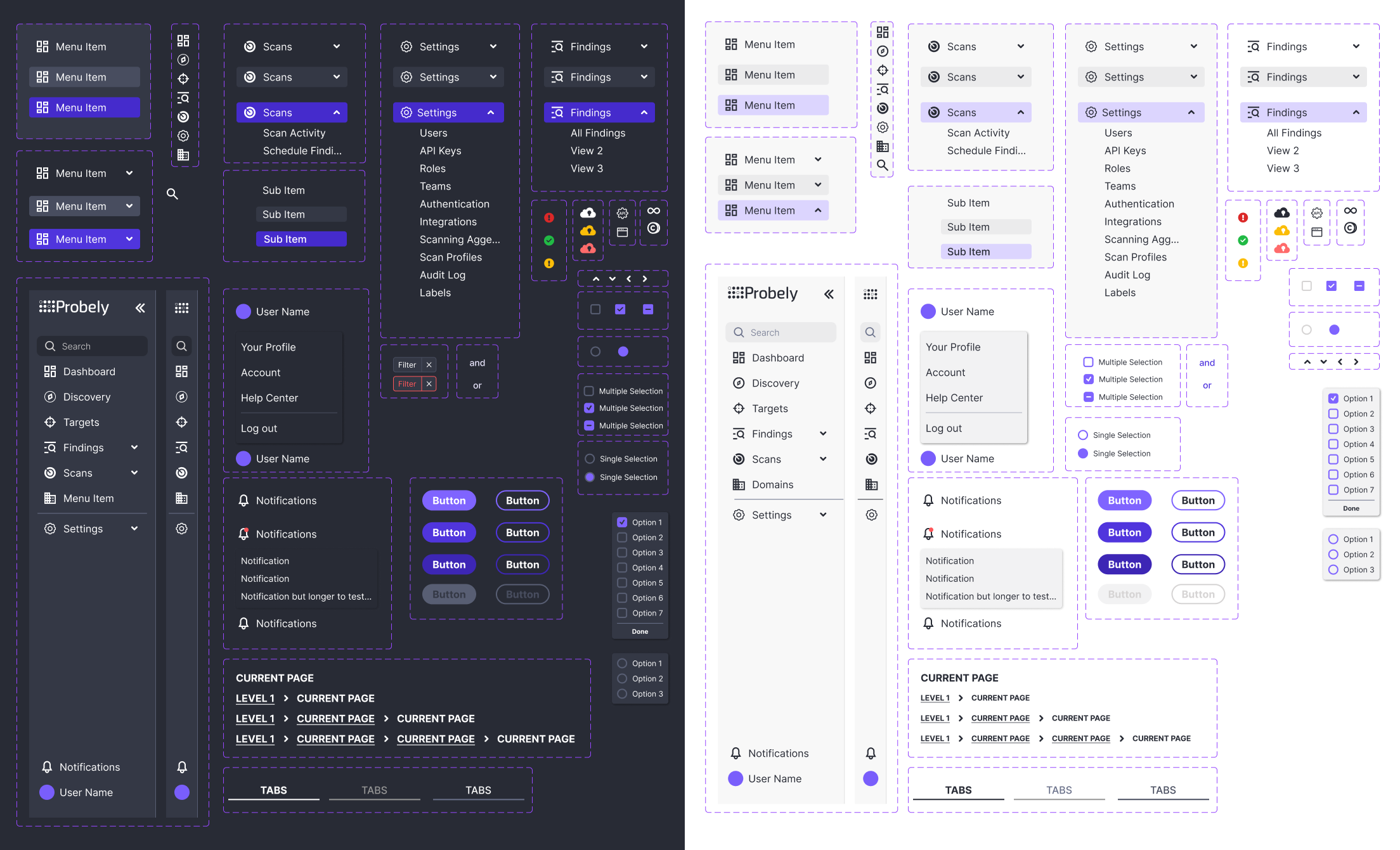
Screens
Tools
Slides

Figma
Mockups

Photoshop

Kittl AI

Use Case

Cybersecurity SaaS
2023 - 2024
The Client, the Project
Probely is a web vulnerability scanner for agile teams. It finds security issues in web applications & APIs and provides guidance on fixing them.
Before being acquired by Snyk, Probely hired me to define the company’s Visual Brand Guidelines - they had a logo and some colors defined, but not a structure of visual elements to be used consistently across departments. The company was founded in 2016, meaning that by the time of my intervention (2023), we weren’t starting from zero.
The Goal
Define visual guidelines that are scalable across platforms.
Position Probely as a modern and trustworthy brand.
The Process
The Outcome
Logo
Original

Improved

Subtle yet striking modifications to the logo: bolder typography and smooth, rounded edges that embody a sophisticated and contemporary aesthetic.
Logo Anatomy
Besides the refinements mentioned above, this redesign was built on a precise grid system to ensure balance, optical clarity, and consistency. This grid-based constructions ensures the logo scales properly in size and also across digital and physical applications without losing is integrity.

Colors
Primary colors & variations
Gradients & Patterns
Typography
Font family: Inter
AaBbCc
AaBbCcDdEeFfGgHhIiJjKkLlMmNnOoPpQqRrSsTtUuVvWwXxYyZz 0123456789€£$&%@?![]()+-=
Heading 1
Font: Inter | Style: Black | Size: 48px | Line Height: 58px | Weight: 900
Heading 2
Font: Inter | Style: Black | Size: 32px | Line Height: 38px | Weight: 900
Heading 3
Font: Inter | Style: Bold | Size: 24px | Line Height: 28px | Weight: 700
Body Text
Font: Inter | Style: Regular | Size: 18px | Line Height: 28px | Weight: 400
Body Text Bold
Font: Inter | Style: Regular | Size: 18px | Line Height: 28px | Weight: 400
Iconography
Social Media
Merch
Design System
Local Components - Dark and Light modes
Screens
Tools
Slides

Figma
Mockups
Photoshop
Kittl AI

Use Case

Cybersecurity SaaS
2023 - 2024
The Client, the Project
Probely is a web vulnerability scanner for agile teams. It finds security issues in web applications & APIs and provides guidance on fixing them.
Before being acquired by Snyk, Probely hired me to define the company’s Visual Guidelines.The company was founded in 2016, meaning that by the time of my intervention (2023), we weren’t starting from zero - they had a logo and some colors defined, but not a structure of visual elements to be used consistently across platforms.
The Goal
Define visual guidelines that are scalable across platforms.
Position Probely as a modern and trustworthy brand.
The Process
The Outcome
Logo
Original

Improved

Subtle yet striking modifications to the logo: bolder typography and smooth, rounded edges that convey a sophisticated and contemporary aesthetic.
Logo Anatomy
Besides the refinements mentioned above, this redesign was built on a precise grid system to ensure balance, optical clarity, and consistency. This grid-based constructions ensures the logo scales properly in size and also across digital and physical applications without losing is integrity.
Colors
Primary colors & variations
Gradients & Patterns
Typography
Font family: Inter
AaBbCc
AaBbCcDdEeFfGgHhIiJjKkLlMmNnOoPpQqRrSsTtUuVvWwXxYyZz 0123456789€£$&%@?![]()+-=
Heading 1
Font: Inter | Style: Black | Size: 48px | Line Height: 58px | Weight: 900
Heading 2
Font: Inter | Style: Black | Size: 32px | Line Height: 38px | Weight: 900
Heading 3
Font: Inter | Style: Bold | Size: 24px | Line Height: 28px | Weight: 700
Body Text
Font: Inter | Style: Regular | Size: 18px | Line Height: 28px | Weight: 400
Body Text Bold
Font: Inter | Style: Regular | Size: 18px | Line Height: 28px | Weight: 400
Iconography
Social Media
Merch
Design System
Local Components - Dark & Light mode
Screens
Tools
Slides
Figma
Mockups
Photoshop
Kittl AI